Using business intelligence and being able to digest data to tell a compelling story have become necessary for company success in an increasingly data-heavy world.
Is your online marketing strategy working? How are customers interacting with you? Where are they coming from? What trends do you see in revenue performance tied to ad spending? The list of possibilities where data visualization can help you goes on and on.
Telling that story without the complexity of raw numbers in spreadsheets with thousands to millions of rows of data is complex. Whichever data visualization tool you choose must match your data needs, big or small.
In this article, we will discuss the best visualization tools in the market to enhance your business performance and productivity.
What is data visualization?
Data visualization is the process of presenting data in visual formats like maps, charts, and graphs. This makes it easier to understand numbers, helping to find valuable insights for anything. These insights can then be used to make better decisions in real-time.
To create effective visualizations, there are many tools out there. These tools offer features like streaming data support, integration with AI, collaborative features, and interactivity. They allow you to explore data visually and make sense of complex information.
In any data-driven business, data visualization is necessary. It turns data into visuals, making it easier to understand, digest and make important business decisions from. Data visualization creates actionable insights your team might not have found otherwise.
There are many data visualization tools available, and we’ve done the research to determine the best for small businesses. These tools should be versatile, easy to use and allow you to visualize data in a variety of ways to suit your business’s needs.
What are the data visualization tools?
Data visualization tools are like magic for turning boring numbers into cool pictures. Imagine you have a bunch of numbers that are super important for making big decisions.
Instead of just looking at those numbers in a boring table, you can use these tools to turn them into colorful charts and graphs that are easy to understand.
Some of the best tools for this are Google Charts, Tableau, Grafana, Chartist, FusionCharts, Datawrapper, Infogram, and ChartBlocks.
These tools can make all sorts of different charts and graphs, and they’re pretty easy to use. They can also handle a lot of data, which is really helpful when you have a ton of numbers to work with.
Basically, these tools help you make sense of data so you can make smarter decisions. They’re like secret weapons for anyone who needs to understand numbers better!
What do the best data visualization tools have in common?
All the top data visualization tools have some things in common. They’re easy to use, which means you don’t need to be a tech genius to understand them. Some tools even come with tutorials to help you get started.
Another key feature is their ability to handle lots of data. They can take a huge amount of information and turn it into easy-to-read charts and graphs.
The best tools can create all sorts of charts, graphs, and maps. Some tools are really good at making one type of chart, while others can do a bunch of different styles.
Finally, there’s the price. The best tools might cost more, but they offer a lot of value with extra features and support. So, while price is important, it’s not the only thing to consider when choosing a data visualization tool.
Data Visualization Tools Comparison
There are dozens, if not hundreds, of applications, tools, and scripts available to create visualizations of large data sets. Many are very basic and have a lot of overlapping features.
But there are standouts that either have more capability for the types of visualizations they can create or are significantly easier to use than the other options out there.
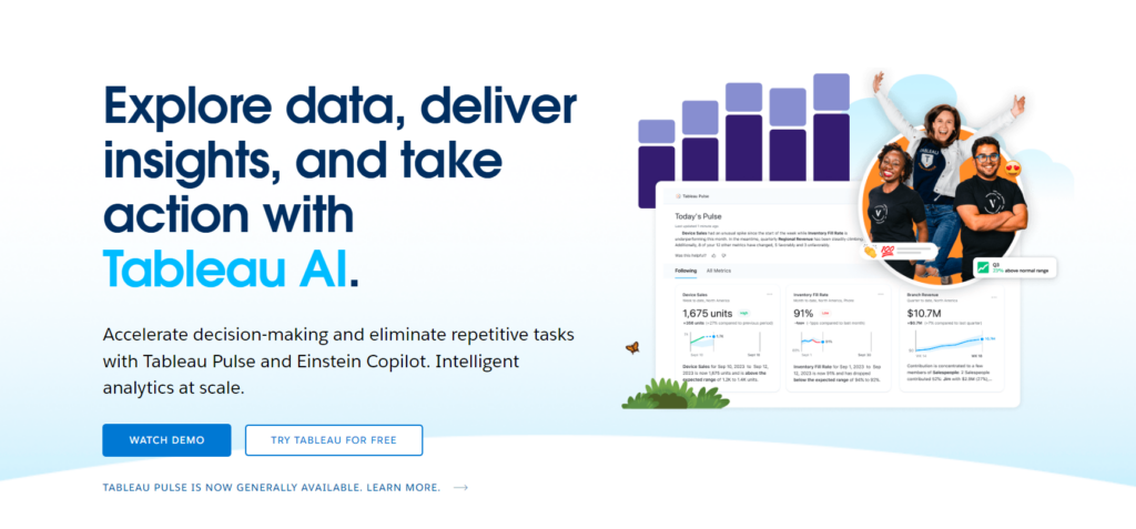
Tableau (and Tableau Public)
Tableau has a variety of options available, including a desktop app, server and hosted online versions, and a free public option. There are hundreds of data import options available, from CSV files to Google Ads and Analytics data to Salesforce data.
Output options include multiple chart formats as well as mapping capability. That means designers can create color-coded maps that showcase geographically important data in a format that’s much easier to digest than a table or chart could ever be.
The public version of Tableau is free to use for anyone looking for a powerful way to create data visualizations that can be used in a variety of settings.
From journalists to political junkies to those who just want to quantify the data of their own lives, there are tons of potential uses for Tableau Public.
They have an extensive gallery of infographics and visualizations that have been created with the public version to serve as inspiration for those who are interested in creating their own.
Tableau is a great option for those who need to create maps in addition to other types of charts. Tableau Public is also a great option for anyone who wants to create public-facing visualizations.
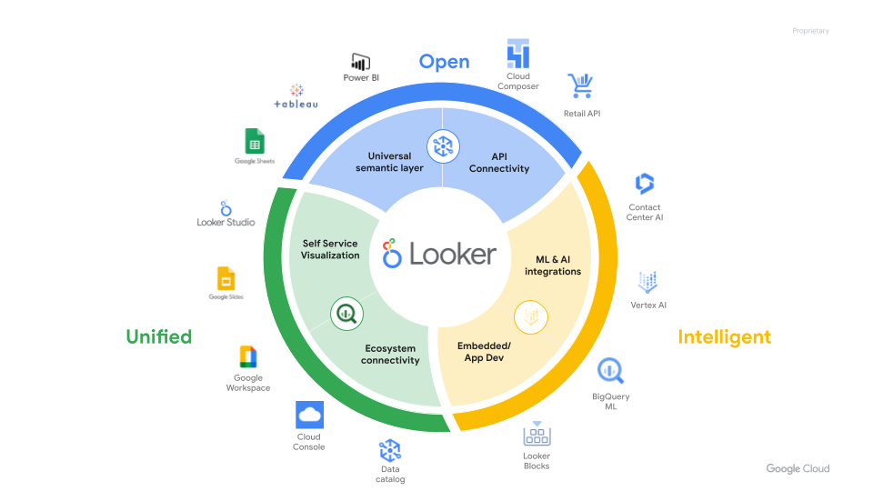
Google Looker Studio
Google Looker Studio is a cutting-edge data visualization and analytics platform that helps businesses explore and analyze their data with unmatched flexibility.
Designed to adapt to your team’s unique needs, this Google tool offers an extensive range of customization options, allowing you to create tailor-made visualizations that convey the story hidden within your data in just a few clicks.
Teams can build interactive charts, dashboards, and reports that bring their data to life. It also adapts effortlessly to your needs, without compromising on functionality.
The best part? Looker Studio is a cloud-based business intelligence tool from Google that can be accessed remotely, making it convenient for data analysts on the go.
It automatically generates data visualizations and allows users to create their own visualizations and interactive dashboards. The platform simplifies report scheduling, making it easier to communicate with clients on important data points.
On the downside, some reviewers say there are slow report loading times and the tool offers limited flexibility for complex queries and analysis. Other reviews say the documentation provided is inadequate, and the tool lacks advanced charting functionality compared to other BI tools.
PowerBI
With its extensive array of interactive visualization options, Microsoft Power BI enables users to create stunning, easy-to-understand reports and dashboards that drive data-driven decision-making. As one the best data visualization tools for business intelligence, Power BI excels at integrating with a wide variety of data sources, making it easy to consolidate and analyze data from across your organization.
Power BI’s user-friendly interface and seamless integration with other Microsoft applications make it an ideal choice for businesses looking to harness the power of their data.
Microsoft Power BI connects to a wide range of data sources such as Google Analytics, Facebook, SQL, data files, and cloud files. It offers an impressive selection of chart types and features a user-friendly drag-and-drop interface for creating interactive reports and dashboards.
Some report the user interface to be clunky, and the data model setup is not very intuitive. Users are also limited by the inability to use multiple datasets as sources, a lack of data source options, and limited customization choices for visuals.
Datawrapper
Datawrapper is specifically designed to cater to the needs of newsrooms and journalists. The platform enables users to create clean, professional-looking visualizations that are easily embeddable in articles and online publications.
With a focus on simplicity, Datawrapper ensures that your visuals convey your message clearly and effectively. The platform’s user-friendly interface and a wide range of chart types—from scatter plots to geographic maps—make it easy for journalists to create compelling visuals that enhance their stories.
Datawrapper lets nontechnical people on your team create data visualizations without the need for any code. That arms more of your team with data science to make rapid, informed decisions.
Reviews say Datawrapper’s simplicity comes at a cost with its interactive data visualizations. Users report the app lacks advanced tools that professional analysts need—making it tough to fully customize.
Salesforce
Salesforce Marketing Cloud Intelligence (formerly Datorama), is on this list of user-friendly data visualization tools. It excels at creating simple yet effective charts for businesses.
With its straightforward interface and diverse chart types, this is one of the best data visualization tools. That’s because it allows users to quickly transform their data into clear, informative visuals.
The platform’s focus on simplicity makes it an excellent choice for teams looking for a no-fuss solution to create data visualizations. If your priority is to create clear, concise charts without the complexity of advanced features, Datorama is a prime candidate for your data visualization toolkit.
Marketing Cloud Intelligence shines in its data import, data visualization, and reporting dashboard tools, which are essential for many businesses. Its ability to pull in various data sources via API integration makes it versatile and adaptable to unique data needs.
Despite its strengths, some users report a complex and time-consuming setup process with this visualization tool. Users may find themselves investing considerable effort in configuring the platform before they can fully take advantage of its features.
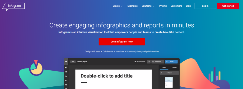
Infogram
Infogram is one of the most popular software programmes on the internet today. It is a web-based tool for creating infographics and visualising data.
It is primarily intended to assist all users in simply creating interactive reports, infographics, and dashboards with data-driven information and images.
This particular solution provides customers with over 550 maps and 35 charts, 20 ready-made design templates, numerous pictures and icons, a drag-and-drop editor, and other features. Even someone who is new to the sector may quickly learn how to utilise this programme.
It has a simple editor that allows users to modify the colours and styles of their visualisations. You can add corporate logos and adjust the display choices.
In addition, the users will be granted the right to use over a million icons, GIFs, and photos in their visualisations. Plus, users may add connections to generate traffic to their website using interactive charts, which allow audiences to examine data using Infogram tabs.
Reports that are interactive and shareable may also be developed and incorporated, with metrics to measure audience interaction.
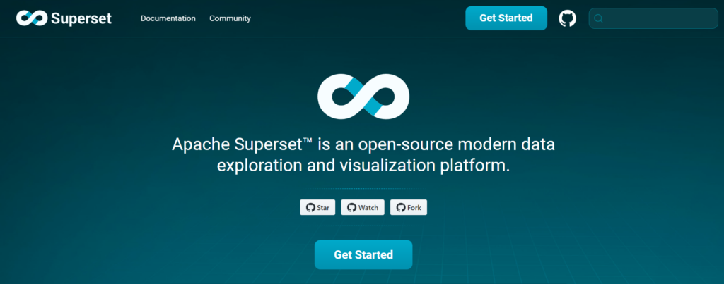
Apache Superset
Apache Superset is a business intelligence tool designed to collect and process data in large volumes. It helps users produce graphs, charts, and other visualizations that aid business growth.
This open-source tool was developed by an Airbnb employee as part of a “hack-a-thon” project. It became part of the Apache Incubator program in 2017 and has gone through many iterations and updates since then.
Apache Superset is a popular business intelligence tool, in part, because of its data visualization and reporting capabilities. The following are some of the most noteworthy ones users can take advantage of:
- Provides dozens of pre-installed visualization options for users to represent data on their dashboards
- Allows users to build custom visualizations
- Integrates with Apache Druid, allowing for faster query performance, real-time responses, and high uptimes
- Allows users to execute SQL queries to explore data
- Uses an extensible security model and integrates with authentication providers like OAuth, OpenID, and LDAP
- Apache Superset is supported by a variety of databases, including Google Big Query, Google Sheets, Amazon Redshift, Amazon Athena, MySQL, Microsoft SQL Server, and Oracle Database.
Along with its business intelligence and data visualization capabilities, Apache Superset offers additional benefits.
Here are some of the most well-known pros:
Like other Apache products, Superset is an open-source tool that is free for all to use. For those who are working with tight budgets, the accessibility of Apache Superset makes it a particularly appealing option.
Apache Superset currently boasts over 40 pre-installed visualization options. It also comes with customization features so that users can create their own data visualization if one of the pre-loaded ones doesn’t align with their vision and needs.
It offers users complete control over their data accessibility. They can add users to their databases, provide access, and track their behavior to ensure they’re not using data in nefarious ways.
You don’t have to know how to code to utilize Apache Superset, which is good news for those seeking a business intelligence tool that doesn’t require a programming background. Business analysts, financial analysts, and other non-coders can use this tool provided they understand the basics of SQL.
What to look for in a data visualization tool?
With so many data visualization tools available, deciding which is right for your needs can be daunting. Here are some of the criteria you can use to help you decide:
Ease of use: Is the user interface (UI) intuitive enough to create the necessary data visualizations? Do you need a drag-and-drop interface for non-coders or a lightweight library for developers?
- Interactivity: Does the target audience for your data visualizations need to filter, zoom, and otherwise interact with your graphics?
- Dashboard capabilities: Is your goal to create a business intelligence (BI) dashboard that can update visuals from live data feeds?
- Customizability: From data presets to chart types to the degree of software integration, how much control do you need over the design and implementation of your data visualizations?
- Integrations: From Amazon Web Services (AWS) to Salesforce to social media, does the data visualization tool have a data connector or API for the app you wish to pull data from?
- Data visualization tools are a diverse bunch: We’ve included a representative sample of the best data visualization tools available: Some tools are better for developers, while others are better for BI analysts.
Choose the tool that best suits your needs. Regardless of which tool you use, the art of telling a compelling story through data visualizations is a skill that must be honed.
Best Data Visualization Tools: Our Conclusion
Business analysts are the most sought-after IT professionals. Today, there is an increased demand for business analysts, but most organizations are facing a severe skills gap, failing to fill key roles.
The rising shortage of new talent is a great opportunity for business analyst aspirants. Learning data visualization tools from an industry-recognized educational institution, such as atomcamp, can help grab better opportunities and get hired in their dream roles.
Atomcamp’s Data Science bootcamp, teaches you 30+ in-demand skills and tools with hands-on industry training in 14+ real-life projects.
FAQs
What is data visualization?
Data visualization is the process of interpreting data in the form of eographic maps, charts, sparklines, infographics, heat maps, or graphs. This helps make data easier to consume and understand.
What are the best data visualization tools?
Some really good data visualization tools are Google Looker Studio, Tableau, Datawrapper, Infogram, and etc.
What are data visualization tools?
Data visualization tools are programs that help turn data into visual representations.
What are data visualization techniques?
Data visualization techniques include knowing your audience, understanding your goals, and choosing the right chart for your audience and dataset. Moreover, it also includes using the correct layout, including comparisons, and telling a tale using the data.